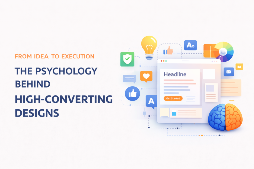
Design is often seen as a visual element—something that makes a website, advertisement, or brand look attractive. But in reality, great design goes far beyond aesthetics. It is deeply rooted in psychology. Every color, shape, font, and layout decision influences how users think, feel, and act.
High-converting designs are not created by chance. They are carefully crafted using psychological principles that guide user behavior. Businesses that understand these principles can create designs that not only look good but also drive real results.
Understanding User Behavior
At the core of design psychology is human behavior. When users interact with a website or a visual, they make decisions within seconds. These decisions are often subconscious and influenced by how the design makes them feel.
For example, a cluttered layout can overwhelm users and cause them to leave, while a clean and organized design creates a sense of ease and trust. Understanding how users process information helps designers create experiences that feel natural and intuitive.
The goal is simple: make it easy for users to understand, navigate, and take action.
The Power of First Impressions
First impressions matter more than ever in the digital world. When a user visits a website or sees an ad, they form an opinion within a few seconds. This initial reaction determines whether they stay or leave.
A strong first impression is created through:
- Clean and modern design
- Clear messaging
- Visually appealing layout
- Fast loading speed
If a design fails to capture attention immediately, users are unlikely to engage further. High-converting designs prioritize clarity and impact right from the start.
Color Psychology
Colors play a powerful role in influencing emotions and decisions. Different colors evoke different feelings, and understanding this can significantly improve design effectiveness.
For example:
- Blue often represents trust and professionalism
- Red creates urgency and excitement
- Green is associated with growth and positivity
- Black conveys luxury and sophistication
Choosing the right color palette helps reinforce the brand message and guide user actions. For instance, a bright and contrasting color for a call-to-action button can increase clicks.
However, it is important to maintain balance. Too many colors can create confusion, while a well-chosen palette creates harmony and focus.
Typography and Readability
Typography is another critical element of design psychology. The way text is presented affects how easily it can be read and understood.
Clear and readable fonts improve user experience, while overly decorative or complex fonts can create frustration. Font size, spacing, and hierarchy also play a role in guiding the user’s attention.
For example:
- Headlines should be bold and attention-grabbing
- Subheadings should organize content
- Body text should be easy to read
Good typography ensures that users can quickly scan content and find what they are looking for.
Visual Hierarchy
Visual hierarchy is the arrangement of elements in a way that guides the viewer’s eye. It helps users understand what is most important and where to focus their attention.
Designers use size, color, contrast, and spacing to create hierarchy. For instance, a large headline at the top of a page immediately draws attention, while smaller text provides supporting information.
A clear visual hierarchy makes navigation easier and improves user engagement. Without it, users may feel lost or confused.
The Role of White Space
White space, also known as negative space, is the empty area between design elements. While it may seem like unused space, it plays a crucial role in improving readability and focus.
White space:
- Reduces visual clutter
- Highlights important elements
- Creates a clean and modern look
High-converting designs use white space effectively to guide users and create a comfortable viewing experience.
Emotional Connection
Design is not just about functionality—it’s about emotion. People are more likely to engage with designs that make them feel something.
Images, colors, and layouts can evoke emotions such as trust, excitement, curiosity, or comfort. For example, a warm and friendly design can make a brand feel approachable, while a sleek and minimal design can convey professionalism.
Creating an emotional connection helps build trust and encourages users to take action.
Call-to-Action (CTA) Optimization
A call-to-action (CTA) is one of the most important elements in any design. It tells users what to do next, whether it’s signing up, making a purchase, or contacting the business.
Effective CTAs are:
- Clear and concise
- Visually distinct
- Placed strategically
For example, a button that stands out with contrasting color and simple text like “Get Started” or “Learn More” is more likely to be clicked.
The placement of the CTA also matters. It should be easily visible and positioned where users naturally look.
Trust and Credibility
Trust is a key factor in conversion. Users are more likely to take action if they feel confident in the brand.
Design elements that build trust include:
- Professional layout
- High-quality visuals
- Testimonials and reviews
- Security badges and certifications
A poorly designed website can create doubt, while a polished and professional design builds credibility.
Simplicity is Key
One of the most important principles of high-converting design is simplicity. Overcomplicated designs can confuse users and reduce engagement.
A simple design focuses on:
- Clear messaging
- Easy navigation
- Minimal distractions
By removing unnecessary elements, designers can create a more focused and effective user experience.
Conclusion
High-converting design is not just about making things look good—it’s about understanding how people think and behave. By applying psychological principles, businesses can create designs that guide users, build trust, and drive action.
From color choices and typography to layout and emotional connection, every detail plays a role in influencing user decisions. The most successful designs are those that combine creativity with strategy, resulting in experiences that are both visually appealing and highly effective.
In the end, great design is not just seen—it is felt. And when users feel the right emotions, they are far more likely to convert.