Be Testee, a Pune-based food brand by Jaiswal’s Brothers, was born from a deeply rooted belief: the best recipes are the ones passed down through generations. From the kitchens of grandmothers and grandfathers came the inspiration to bottle authentic flavors — pickles, spices, and sauces — and share them with the world. Their promise is simple: everything you buy will always be tasty.
Challenge
When Jaiswal’s Brothers approached us, they had the recipes, the passion, and the products — but no brand identity to take them to market. They needed a name that carried meaning, a logo that told their story, and packaging that would make their products stand out on shelves. Our task was to build a complete brand from the ground up, covering the brand name, logo, and packaging designs for their pickle and sauce product lines.
Brand Name
The name “Be Testee” was crafted to make one bold promise to every customer: whatever you pick from this brand, it will be tasty. Rooted in the legacy of home-style recipes shared by forefathers, the name is confident, direct, and memorable. It positions the brand not just as a food product, but as a guarantee of taste and authenticity.
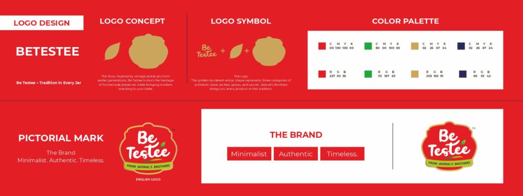
Logo Design
The logo draws its identity from the traditional pickle jar — the very vessel in which generations stored their handcrafted recipes. The vintage jar silhouette forms the core icon, framed by a golden border that represents richness and heritage. The bold red background brings energy and tradition together. Script typography for “Be Testee” adds warmth and personality, while “From Jaiswal’s Brothers” anchors the brand to its makers. Every element of the logo ties back to one story: authentic taste, crafted by family.
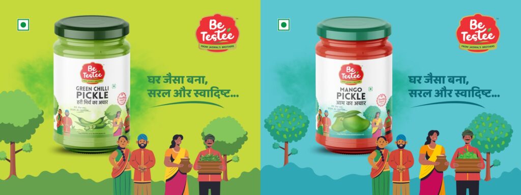
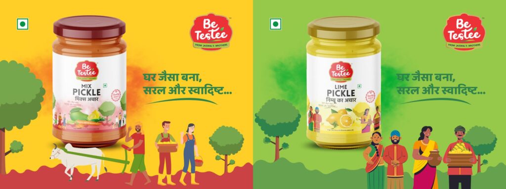
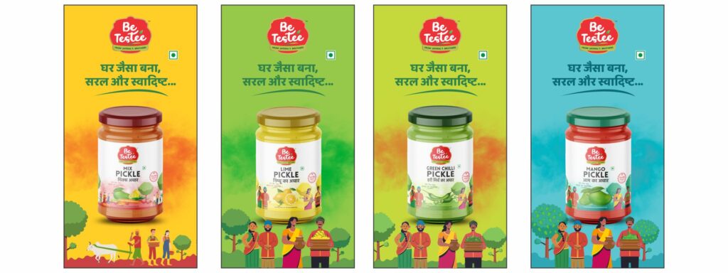
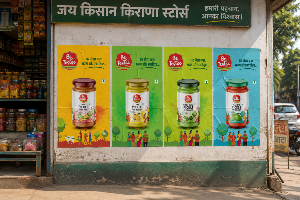
Packaging Design – Pickles
We developed packaging for four distinct pickle variants. Each design maintains the brand’s warm, heritage-driven aesthetic while clearly differentiating the variants. The jar-shaped visual language runs consistently across all four, making them instantly recognizable as a family of products.
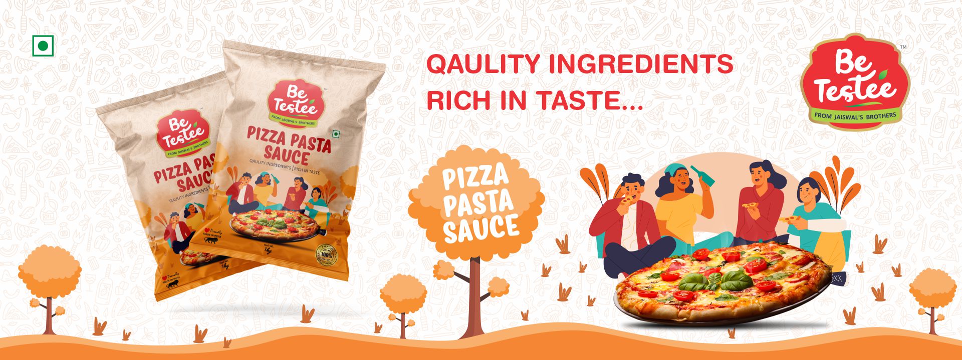
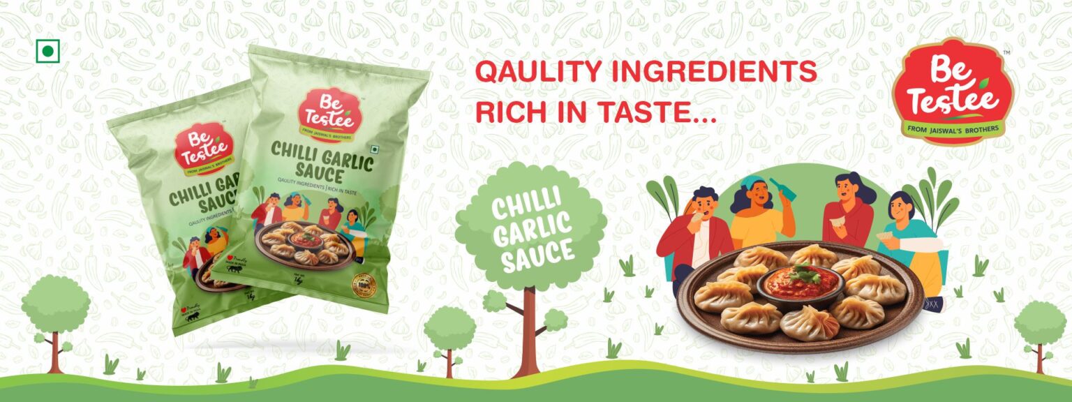
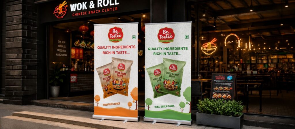
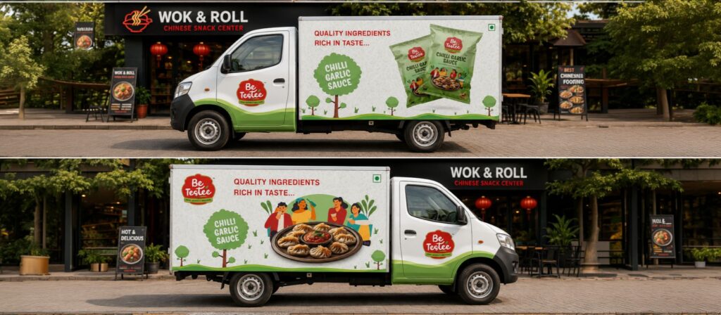
Packaging Design – Sauces
For the four sauce variants, the packaging was designed to appeal to the modern snacking audience while staying true to the brand’s roots. Bold colors, clean layouts, and the consistent Be Testee identity ensure the sauce line feels like a natural extension of the brand.
Conclusion
Our work with Jaiswal’s Brothers transformed a family legacy into a market-ready brand. From a meaningful name rooted in heritage to a logo inspired by traditional pickle jars, and packaging that speaks directly to the modern consumer — Be Testee is now positioned as a brand built on authenticity. One that carries the taste of generations into every jar, every bottle, and every shelf it sits on.