
How Great Brands Are Built: A Step-by-Step Branding Process for Startups & SMEs
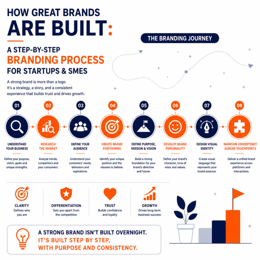
Introduction Every successful business begins with an idea, but not every idea becomes a successful brand. Every year, thousands of startups launch with innovative products and ambitious founders. Some quickly gain recognition, attract loyal customers, and establish themselves as industry leaders. Others struggle to differentiate themselves, compete primarily on price, and eventually disappear from the market. The difference is rarely the product alone. More often, the difference lies in branding. A strong brand creates recognition, builds trust, communicates value, and gives customers a reason to choose one business over another. It transforms a product into an experience and a company into a memorable identity. Many entrepreneurs believe branding starts with designing a logo or choosing brand colors. While visual identity is an important part of branding, it represents only a small portion of the overall process. True branding begins much earlier. It starts with understanding the business, the customer, the market, and the unique value the company brings. Only then do visual identity, messaging, packaging, website design, and marketing come together to create a consistent brand experience. Whether you are launching a startup, expanding an SME, or rebranding an existing business, following a structured branding process helps build a foundation for sustainable growth. At BlackBuck Design Studios, we have worked with businesses across industries including FMCG, healthcare, manufacturing, personal care, SaaS, and retail. One lesson remains consistent across every project: brands that invest in strategy before design build stronger customer relationships and achieve long-term success. What Is a Brand? Before understanding how brands are built, it’s important to understand what a brand actually is. A brand is not just a logo. It is not your company name. It is not your packaging alone. A brand is the complete perception customers have about your business. Every interaction contributes to your brand. Your product quality. Your customer service. Your website. Your packaging. Your advertisements. Your social media presence. Your tone of communication. Even the experience customers have after purchasing your product shapes your brand. In simple words: Your brand is what people think, feel, and remember about your business when you are not in the room. Strong brands intentionally shape these perceptions. Why Branding Matters for Startups and SMEs Large corporations often have significant advertising budgets. Startups and small businesses usually do not. This makes branding even more important. When your brand clearly communicates who you are, what you offer, and why customers should trust you, every marketing effort becomes more effective. Strong branding helps businesses: For startups entering competitive markets, branding often becomes one of the most valuable business assets. Step 1: Understand Your Business Every successful branding project begins with understanding the business itself. Before creating visual identity, businesses should answer fundamental questions. Why does the company exist? What problem does it solve? Who benefits from the solution? What makes the business different? What long-term impact does it want to create? These questions define the foundation of the brand. Without clear answers, branding becomes superficial. At BlackBuck Design Studios, every branding project begins with discovery sessions that explore the company’s vision, goals, values, products, and competitive landscape. Great branding starts with clarity. Step 2: Research Your Market and Competitors Branding should never happen in isolation. Businesses need to understand the environment in which they compete. Market research reveals: Competitive analysis is equally important. The goal is not to copy competitors but to identify opportunities for differentiation. For example, if every skincare brand uses similar colors and messaging, a new brand can stand out by creating a distinct visual identity and a more authentic story. Differentiation is one of the strongest drivers of brand success. Step 3: Define Your Target Audience One of the biggest branding mistakes businesses make is trying to appeal to everyone. Brands become stronger when they clearly define whom they serve. Effective audience research includes: Understanding customers allows businesses to create messaging, products, and experiences that resonate emotionally. People don’t buy products simply because they exist. They buy solutions to problems. The better a brand understands those problems, the more valuable it becomes. Step 4: Create Your Brand Positioning Positioning defines how customers should perceive your business compared to competitors. It answers a simple but powerful question: Why should customers choose you instead of someone else? Strong positioning focuses on differentiation rather than imitation. For example: Volvo positions itself around safety. Apple positions itself around innovation and premium experiences. Nike positions itself around performance and inspiration. Your positioning should be clear, believable, and relevant to your target audience. Without positioning, brands compete primarily on price. Step 5: Define Your Brand Purpose, Mission and Vision Customers increasingly support brands that stand for something meaningful. Purpose explains why your business exists beyond making profits. Mission explains what your company does today. Vision describes where the company wants to go in the future. Together, these elements guide every branding decision. They also help employees align around a common objective. Purpose-driven brands often create stronger emotional connections with customers. Step 6: Develop Your Brand Personality Imagine your brand as a person. Would it be professional? Friendly? Innovative? Luxury-focused? Traditional? Playful? Reliable? Brand personality influences: Consistency in personality helps customers recognize and remember the brand more easily. Step 7: Design Your Visual Identity Only after completing the strategic foundation should businesses begin designing visual assets. Visual identity includes: These elements should reflect the strategy developed during the previous stages. Design should never be based solely on personal preferences. It should communicate the desired brand perception. Great design supports strategy. It does not replace it. Step 8: Build Consistency Across Every Touchpoint Customers interact with brands across multiple channels. Your website. Social media. Packaging. Email communication. Advertising. Sales presentations. Retail stores. Customer support. Each touchpoint should reinforce the same identity. Consistency increases familiarity. Familiarity builds trust. Trust influences purchasing decisions. Strong brands remain recognizable regardless of where customers encounter them. Why Consistency Builds Strong Brands Many businesses launch with impressive branding but gradually lose consistency. Logos change frequently. Colors vary across platforms.
Packaging Design That Sells: The Psychology Behind Consumer Buying Decisions
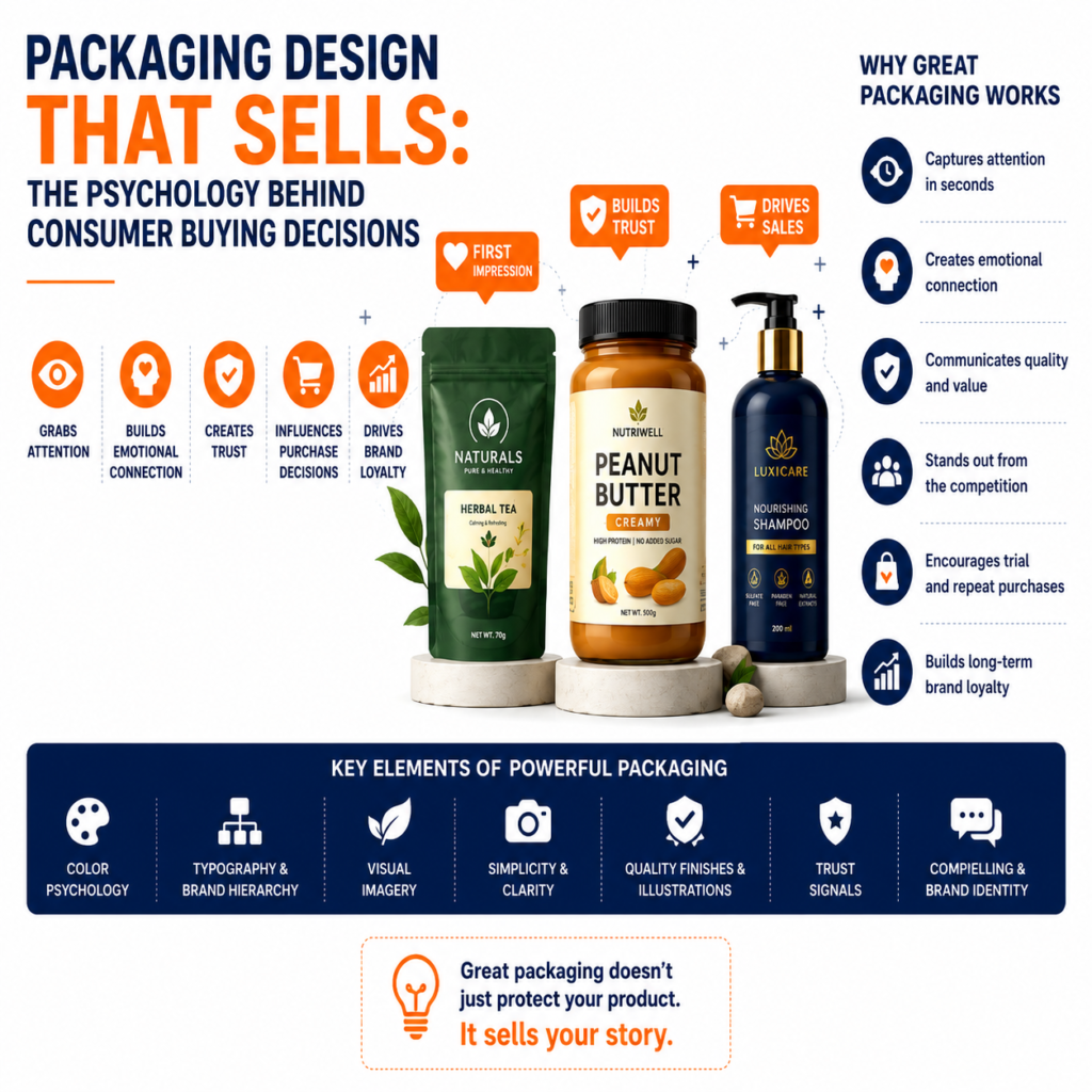
Introduction Imagine walking into a supermarket looking for a jar of peanut butter, a packet of tea, or a bottle of shampoo. Hundreds of products are placed on the shelves, many offering similar quality, pricing, and benefits. Yet, within a few seconds, you instinctively pick up one particular product. What influenced your decision? In most cases, it wasn’t the ingredients, the manufacturing process, or even the price. It was the packaging. Before customers experience the product, they experience the packaging. It is the first conversation a brand has with its audience. Within just a few seconds, packaging communicates quality, trust, value, personality, and even the emotions associated with the brand. This is why packaging design is much more than creating an attractive label. It is a powerful marketing tool that directly influences purchasing decisions. Research consistently shows that consumers often make buying decisions within seconds of noticing a product on a shelf or while browsing online. During this short period, packaging plays one of the most significant roles in attracting attention and building confidence. For businesses, especially in industries like food, beverages, cosmetics, healthcare, wellness, personal care, and FMCG, packaging can become the difference between being noticed or being ignored. At BlackBuck Design Studios, we believe great packaging is a combination of strategy, psychology, branding, and creativity. Every design decision—from colors and typography to material selection and product hierarchy—should guide customers toward one outcome: choosing your product over the competition. Why Packaging Is More Than Just a Container Many business owners think packaging exists only to protect a product during transportation. While protection is certainly one of its functions, modern packaging serves many more purposes. Today’s packaging acts as: Imagine two products placed side by side. Both offer similar quality. Both have similar pricing. One has professionally designed packaging with clear branding, premium finishes, and an organized information hierarchy. The other has outdated graphics, inconsistent typography, poor color choices, and cluttered information. Which product appears more trustworthy? Most consumers instinctively choose the professionally packaged product because visual quality influences perceived product quality. In many purchasing decisions, customers don’t evaluate the product first—they evaluate its packaging. The Psychology Behind Consumer Buying Decisions Buying decisions are often emotional before they become logical. Consumers rarely analyze every product in detail. Instead, their brains process visual information quickly and subconsciously. Packaging becomes a shortcut that helps people judge: Good packaging reduces uncertainty. Poor packaging increases hesitation. Understanding consumer psychology helps businesses design packaging that connects emotionally with buyers. First Impressions Influence Purchase Decisions Human beings naturally form opinions within moments of seeing something new. This psychological behavior applies equally to products on retail shelves. When shoppers walk through supermarkets, pharmacies, or cosmetic stores, they rarely inspect every available option. Instead, they scan shelves quickly. Products that stand out visually receive attention first. Only after grabbing attention do customers begin reading product details. This means packaging has one primary responsibility: Earn the customer’s attention before the competition does. Without attention, even an excellent product remains invisible. Color Psychology in Packaging Design Color is often the first element customers notice. Different colors create different emotional responses. Understanding color psychology helps brands communicate their positioning more effectively. For example: Blue Blue creates feelings of trust, reliability, and professionalism. It is commonly used for healthcare, technology, and water products. Green Green represents health, nature, freshness, and sustainability. Organic foods, Ayurvedic products, and eco-friendly brands frequently use green. Red Red attracts immediate attention. It communicates excitement, energy, appetite, and urgency. Food brands often use red because it stimulates appetite. Yellow Yellow conveys optimism, happiness, and warmth. It is effective for products targeting families and children. Black Black represents luxury, sophistication, and exclusivity. Premium cosmetics, perfumes, and luxury food products often rely on black packaging. White White communicates purity, simplicity, and cleanliness. Healthcare and skincare products frequently use white to create a sense of safety and hygiene. Successful packaging doesn’t simply use attractive colors. It uses colors strategically to influence customer perception. Typography Builds Brand Personality Typography is another powerful psychological tool. Customers unconsciously associate different fonts with different brand personalities. For example: Elegant serif fonts often communicate tradition, luxury, and craftsmanship. Modern sans-serif fonts communicate simplicity, innovation, and accessibility. Bold typography creates confidence. Minimal typography creates sophistication. Poor typography, however, reduces credibility. When product information becomes difficult to read, customers may question the overall quality of the product. Clear typography improves both trust and usability. Visual Hierarchy Guides Customer Attention Customers don’t read packaging like a book. They scan it. Great packaging controls the order in which information is consumed. A strong visual hierarchy ensures customers notice: When hierarchy is poorly designed, customers struggle to understand what the product is or why they should buy it. Good hierarchy simplifies decision-making. Simplicity Creates Premium Perception One of the biggest mistakes businesses make is trying to communicate everything at once. They fill the packaging with: The result feels cluttered. Premium brands take the opposite approach. They communicate fewer messages more effectively. Minimalism creates clarity. Clarity builds confidence. Confidence increases purchase intent. This is why many luxury brands use generous white space and restrained visual elements. Product Photography and Illustrations Visuals significantly influence customer expectations. Food packaging featuring high-quality photography appears more appetizing. Cosmetic packaging with elegant illustrations often feels premium. Healthcare packaging benefits from clean, professional visuals that communicate trust. Poor-quality images reduce perceived product value. Custom illustrations and professional product photography create stronger emotional connections than generic stock imagery. Packaging Must Reflect the Target Audience Every product serves a different audience. Packaging should reflect those customers’ expectations. For example: Children’s products typically use bright colors, playful illustrations, and rounded typography. Luxury skincare often features minimal layouts, elegant typography, and premium finishes. Ayurvedic wellness products frequently combine earthy colors, botanical illustrations, and natural textures to communicate authenticity. Packaging should never be designed based solely on personal preference. It should be designed for the people who are most likely to purchase the product. Trust Signals Influence Buying Decisions Customers look for
Mobile-First Design in 2026: Why It Still Matters
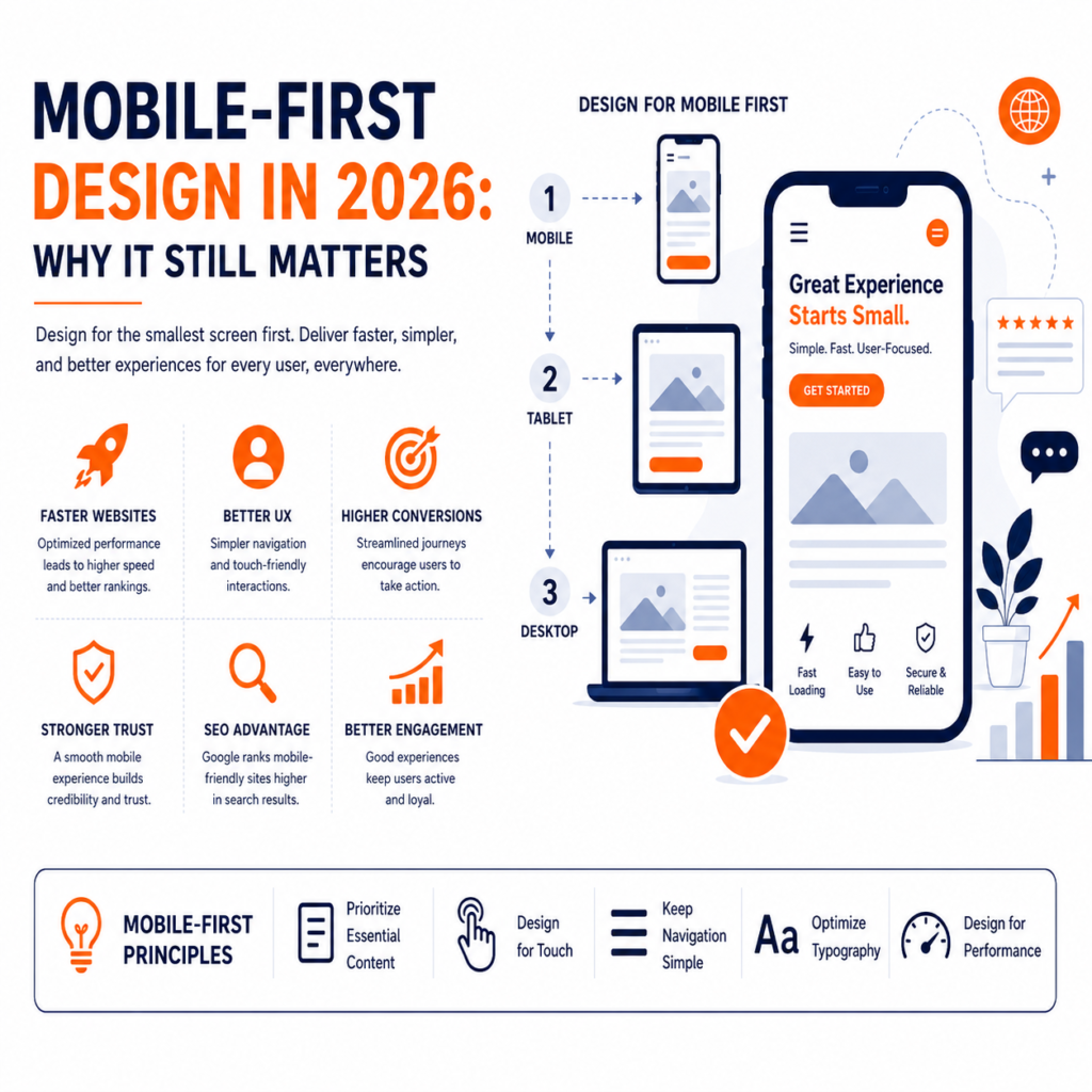
Introduction Take a moment to think about how often you use your smartphone in a day. Whether it’s searching for a restaurant, shopping online, checking emails, booking appointments, reading the news, or browsing social media, most digital interactions now happen on mobile devices. For millions of people, the smartphone is no longer a secondary device—it is their primary gateway to the internet. This shift has fundamentally changed how businesses should approach digital design. A decade ago, websites were designed for desktop screens and later adapted for mobile devices. Today, that approach no longer meets user expectations. Modern businesses must start with the smallest screen first and build experiences that work seamlessly across every device. This philosophy is known as mobile-first design. Although mobile-first design has been discussed for years, many business owners still believe it is simply about making a website responsive. In reality, it is much more than that. It is a strategic design approach that prioritizes user needs, simplifies content, improves performance, and creates better digital experiences from the very beginning. As we move through 2026, mobile-first design remains one of the most important principles in UI/UX and website development. User expectations continue to rise, search engines prioritize mobile experiences, and businesses that fail to optimize for mobile risk losing both traffic and customers. At BlackBuck Design Studios, we believe that great digital experiences begin with understanding how people actually use technology. Since mobile devices have become the primary touchpoint for most users, designing for mobile first is no longer a trend—it is a business necessity. What Is Mobile-First Design? Mobile-first design is a design and development strategy where the product is created for mobile devices before expanding to tablets, laptops, and desktops. Instead of starting with a large desktop layout and removing elements to fit smaller screens, designers begin with the essentials. This forces teams to focus on: Once the mobile experience is optimized, additional features and layouts can be progressively enhanced for larger screens. This approach creates cleaner, more focused digital products that work well across all devices. Why Mobile-First Still Matters in 2026 Some businesses assume that because responsive design has become common, mobile-first design is no longer important. The opposite is true. User behavior continues to evolve, and mobile usage remains dominant across many industries. Whether customers are searching for products, comparing services, reading reviews, or making purchases, they increasingly expect seamless mobile experiences. Businesses that ignore mobile-first principles often experience: Meanwhile, businesses that prioritize mobile usability create experiences that are faster, simpler, and more enjoyable. Mobile Is Often the First Brand Experience For many companies, the first interaction a customer has with the brand happens on a smartphone. Imagine someone discovers your business through a Google search, Instagram advertisement, or LinkedIn post. They tap the link expecting a smooth experience. Instead, they find: Most users will leave immediately. They won’t contact your business. They won’t complete the purchase. They may never return. First impressions are increasingly formed on mobile devices. That makes mobile-first design essential for building trust. Google’s Mobile-First Indexing Google has fundamentally changed how it evaluates websites. Instead of primarily analyzing desktop versions, Google now focuses on the mobile version of a website when determining rankings. This means your mobile experience directly influences your search engine visibility. If your mobile website loads slowly, contains poor navigation, or provides a frustrating user experience, it can negatively impact your SEO performance. Businesses investing in content marketing, paid advertising, and search engine optimization should understand that driving traffic is only part of the equation. If visitors have a poor mobile experience, much of that investment is wasted. Benefits of Mobile-First Design 1. Faster Websites Performance is one of the biggest advantages of mobile-first design. Since designers prioritize essential content and lightweight layouts, mobile-first websites generally load faster. Fast-loading websites improve: Speed is no longer just a technical requirement—it is part of the user experience. 2. Better User Experience Small screens force designers to simplify interfaces. This often leads to cleaner layouts, better navigation, and more focused user journeys. When users don’t have to search for important information, they complete tasks more efficiently. Good mobile experiences reduce friction and increase confidence. 3. Improved Conversion Rates Whether users are booking appointments, purchasing products, downloading resources, or submitting enquiry forms, every unnecessary step reduces conversions. Mobile-first design simplifies these interactions. Shorter forms, larger buttons, simplified navigation, and clearer calls-to-action encourage users to complete their goals. Businesses frequently see improved conversion rates after optimizing mobile usability. 4. Stronger Brand Perception Customers associate digital quality with business quality. A smooth mobile experience communicates professionalism. A frustrating experience creates doubt. Modern customers expect businesses to deliver excellent experiences regardless of screen size. Professional mobile design demonstrates attention to detail and customer care. Core Principles of Mobile-First Design Prioritize Essential Content Small screens leave little room for unnecessary information. Every section should answer an important user question. Instead of overwhelming visitors, focus on helping them complete their primary objective. Design for Touch Unlike desktop users, mobile users interact using their fingers. Buttons should be large enough to tap comfortably. Links should have adequate spacing. Interactive elements should reduce accidental clicks. Touch-friendly design improves usability and accessibility. Keep Navigation Simple Complicated navigation creates frustration. Limit menu options to the most important pages. Organize content logically. Help users reach their destination with as few taps as possible. Optimize Typography Text should remain readable without zooming. Maintain sufficient spacing between paragraphs. Use clear heading hierarchies. Readable typography improves comprehension and reduces user fatigue. Design for Performance Performance begins during the design process. Compress images. Reduce unnecessary animations. Minimize large files. Optimize code. Every improvement contributes to a smoother user experience. Real-World Examples Many of the world’s most successful companies embrace mobile-first thinking. Instagram was designed primarily for mobile interactions, making it intuitive for users to browse, engage, and create content. Uber simplifies complex transportation services into a few straightforward steps, allowing users to book rides quickly even in busy environments. Amazon continuously refines
Designing for Trust: How Visual Design Influences Customer Decisions
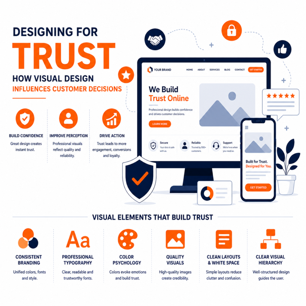
Introduction Imagine visiting two websites for the first time. The first website has blurry images, inconsistent colors, poor typography, outdated layouts, and confusing navigation. The second website is clean, professionally designed, easy to navigate, and visually appealing. Even before reading a single word, you’ve already formed an opinion about both businesses. This is the power of visual design. People don’t just buy products or services—they buy confidence, credibility, and trust. In today’s digital-first world, where customers often interact with a brand online before speaking to a salesperson or visiting a physical store, visual design becomes one of the strongest signals of professionalism and reliability. Research in consumer psychology consistently shows that people make first impressions within seconds. Those initial impressions are largely influenced by visual elements such as layout, colors, typography, imagery, spacing, and consistency. Once that first impression is formed, it becomes much harder to change. For businesses, this means that design is no longer just about aesthetics. It directly impacts customer perception, purchasing decisions, conversion rates, and long-term loyalty. Whether you’re launching a startup, building an e-commerce store, creating a SaaS platform, or redesigning a corporate website, every design decision communicates something about your brand. A polished and consistent design tells customers that your business is professional and trustworthy. A cluttered or outdated design can create doubt, even if your product or service is excellent. At BlackBuck Design Studios, we believe that great design should do more than look beautiful—it should inspire confidence. Every element, from typography and color palettes to packaging and website layouts, should reinforce trust and encourage customers to take the next step. Why Trust Is the Foundation of Every Buying Decision Before customers make a purchase, submit an enquiry, or download an application, they ask themselves one simple question: “Can I trust this business?” If the answer is yes, they move forward. If the answer is no—or even “I’m not sure”—they leave. Trust isn’t created by a single factor. It’s built through a combination of brand reputation, customer reviews, product quality, communication, and user experience. However, one of the earliest and most influential trust signals is visual design. When users visit a website, they don’t immediately analyze your technical capabilities or read every page. Instead, they subconsciously evaluate whether your business appears credible. Professional design communicates: Poor design communicates the opposite. This is why businesses should consider visual design not as an expense but as an investment in customer confidence. The Psychology Behind Visual Design Human beings process visual information much faster than text. Long before someone reads your company description, they have already interpreted your brand through visual cues. This happens because the brain naturally looks for patterns. When layouts are clean, typography is consistent, and visual hierarchy is well structured, users feel comfortable. They understand where to look, what to do next, and how to navigate the experience. When design feels disorganized, users experience uncertainty. That uncertainty often translates into hesitation. And hesitation reduces conversions. Good design minimizes uncertainty by making interactions feel familiar and intuitive. First Impressions Matter More Than Ever Digital interactions happen incredibly fast. Within a few seconds, visitors decide whether they want to continue exploring your website or leave. These early moments are critical because customers often associate visual quality with business quality. For example, imagine looking for a financial advisor online. One website appears modern, clean, and professionally designed. Another uses outdated graphics, inconsistent fonts, broken layouts, and poor-quality images. Even if both companies offer similar services, most people will naturally trust the first one. The same principle applies across industries, including healthcare, education, manufacturing, technology, real estate, hospitality, and e-commerce. Good design immediately communicates credibility. Visual Elements That Build Trust 1. Consistent Branding Consistency creates familiarity. When customers see the same colors, typography, logo usage, photography style, and messaging across your website, packaging, social media, and marketing materials, they perceive your business as more reliable. Imagine if your website used blue branding while your packaging used red, your Instagram followed another style, and your brochures looked completely different. The inconsistency would create confusion. Strong brands maintain consistency across every customer touchpoint. Companies like Apple, Nike, Coca-Cola, and Airbnb have mastered this principle. Their visual identity remains instantly recognizable wherever customers encounter the brand. 2. Professional Typography Typography influences readability and perception. Clear, modern fonts improve comprehension and create a polished appearance. Poor typography—such as inconsistent font sizes, excessive styles, or difficult-to-read text—creates friction and reduces trust. Good typography helps users absorb information effortlessly while reinforcing your brand personality. Luxury brands often use elegant serif fonts to communicate sophistication, while technology companies typically prefer clean sans-serif fonts to emphasize innovation and simplicity. Choosing typography strategically strengthens brand communication. 3. Color Psychology Color influences emotions more than many businesses realize. Different colors create different psychological associations. For example: Financial institutions frequently use blue because customers associate it with stability. Healthcare organizations often use green or blue because these colors evoke calmness and reliability. Luxury brands rely on black and white to communicate exclusivity. Selecting colors intentionally helps reinforce the message your brand wants to communicate. 4. High-Quality Photography and Visuals Customers naturally associate image quality with business quality. Professional photography communicates authenticity and attention to detail. Poor-quality stock images, pixelated graphics, or inconsistent visuals reduce credibility. Whenever possible, businesses should use original photography, custom illustrations, or professionally designed graphics that reflect their actual products, team, or work. Authenticity builds trust. 5. Clean Layouts and White Space Many businesses believe adding more information makes their website more valuable. The opposite is often true. Overcrowded pages overwhelm users and make important information difficult to find. White space improves readability, directs attention, and creates a premium appearance. Minimalism is not about removing content. It is about organizing content so users can consume it effortlessly. Brands like Apple have demonstrated how simplicity creates confidence. 6. Clear Visual Hierarchy Every page should naturally guide users toward the next action. Visual hierarchy is achieved through: Instead of forcing users to search for information,
The Role of AI in Modern UI/UX Design: Opportunity or Challenge?
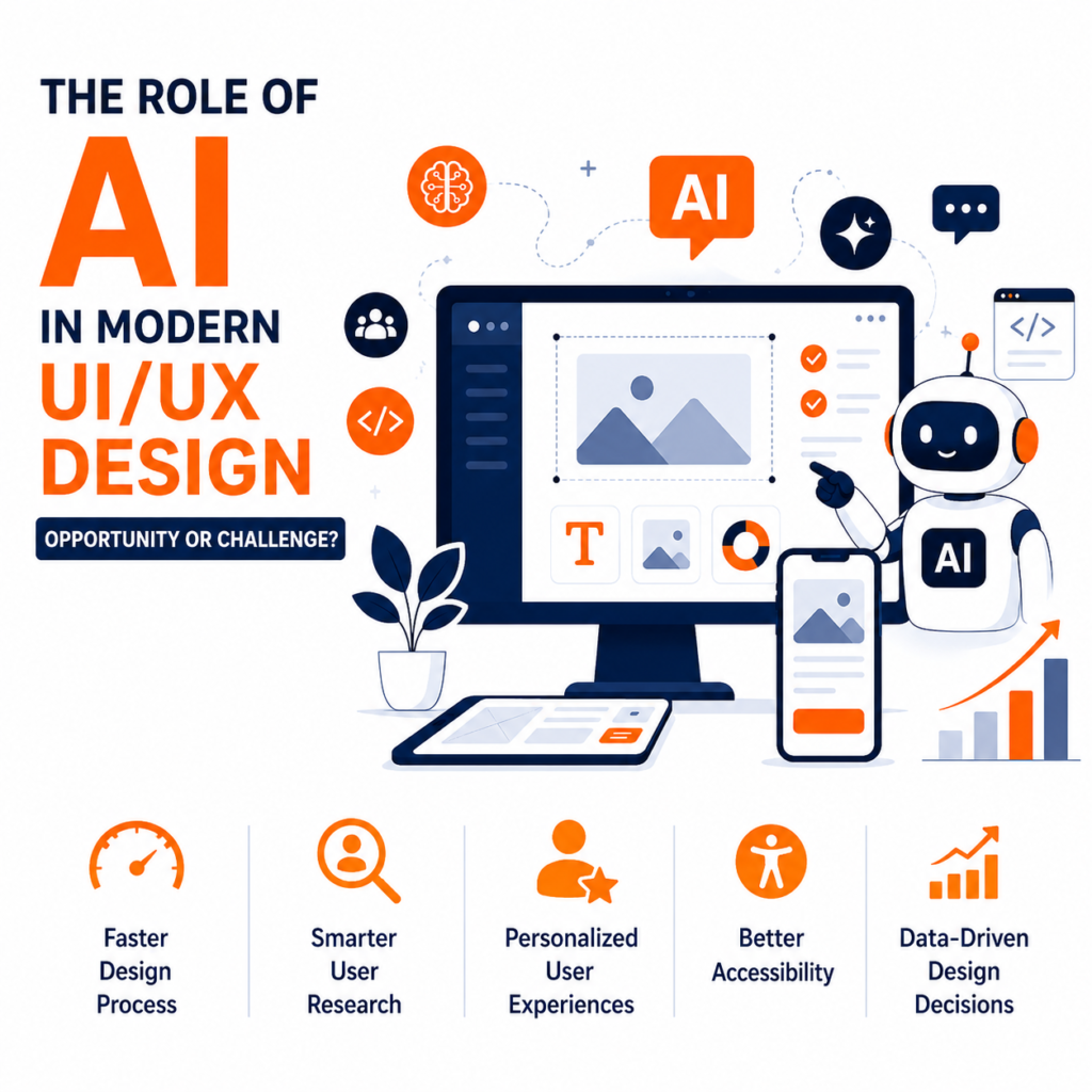
Introduction Artificial Intelligence (AI) is no longer a futuristic concept—it has become an integral part of how digital products are designed, built, and experienced. Over the past few years, AI has transformed industries ranging from healthcare and finance to education and e-commerce. Today, it is also reshaping one of the most creative fields in technology: UI/UX design. Designers once relied entirely on manual research, wireframing, prototyping, and user testing to create digital experiences. While these practices remain essential, AI-powered tools are changing the way designers work. From generating interface layouts and writing UX copy to analyzing user behavior and predicting design improvements, AI is helping teams work faster and make more informed decisions. However, this rapid transformation has sparked an important debate. Will AI replace UI/UX designers, or will it become their most valuable assistant? The answer lies somewhere in the middle. AI is exceptionally good at automating repetitive tasks, identifying patterns in large datasets, and generating design suggestions within seconds. But creativity, empathy, critical thinking, and understanding human emotions remain qualities that only designers can provide. Rather than replacing designers, AI is changing their role. The future belongs to designers who know how to combine human creativity with artificial intelligence to build experiences that are efficient, meaningful, and user-centered. At BlackBuck Design Studios, we see AI not as a threat but as a powerful tool that enhances the design process. It enables our team to work more efficiently while ensuring that every design decision is guided by real human needs rather than automation alone. Understanding AI in UI/UX Design Artificial Intelligence in UI/UX design refers to the use of machine learning, predictive analytics, natural language processing, and generative AI to improve the design process and enhance user experiences. Unlike traditional software that follows predefined instructions, AI learns from data and continuously improves its recommendations. In the context of UI/UX, AI can help designers: Instead of replacing creativity, AI handles repetitive work, allowing designers to focus on solving complex problems and creating memorable user experiences. Why AI Is Transforming Product Design Modern digital products generate enormous amounts of user data every day. Every click, scroll, search, purchase, and interaction provides valuable insights into user behavior. Traditionally, analyzing this information required weeks of manual research. Today, AI processes millions of data points within minutes. For example, AI can identify: These insights help designers make evidence-based decisions instead of relying solely on assumptions. This shift from intuition to data-driven design has become one of AI’s biggest contributions to modern UI/UX. The Biggest Opportunities AI Brings to UI/UX Design 1. Faster Design Process One of AI’s greatest advantages is speed. Designers can now generate wireframes, layouts, icons, illustrations, and prototypes within minutes instead of spending hours creating everything manually. Tools like Figma AI, Adobe Firefly, Uizard, and Galileo AI help teams quickly explore multiple design directions. Rather than replacing designers, these tools accelerate brainstorming and allow more time for refinement and strategic thinking. For startups working with tight deadlines, this speed can significantly reduce product development time. 2. Smarter User Research Understanding users has always been one of the most time-consuming parts of UX design. AI simplifies this process by analyzing customer behavior at scale. Instead of manually reviewing thousands of survey responses or usability sessions, AI identifies recurring patterns and pain points automatically. For example, AI can detect: This enables designers to prioritize improvements based on real evidence rather than assumptions. 3. Personalized User Experiences Today’s users expect products to adapt to their preferences. AI makes this possible through personalization. Streaming platforms like Netflix recommend content based on viewing history. Spotify creates personalized playlists using listening behavior. Amazon recommends products based on browsing and purchasing patterns. These experiences are powered by AI and significantly improve user satisfaction. The same principles apply to websites, mobile applications, and SaaS platforms. Instead of presenting identical interfaces to everyone, AI enables businesses to create experiences tailored to individual users. 4. Better Accessibility Accessibility has become a critical aspect of digital product design. AI is helping designers create experiences that are more inclusive. Modern AI tools can: This makes digital products more accessible to users with diverse needs while improving usability for everyone. 5. Improved Design Decisions Through Data Design has traditionally involved a combination of creativity and intuition. While intuition remains valuable, AI introduces another important element: data. Instead of debating which layout might perform better, AI helps teams evaluate user behavior and identify the most effective design solutions. This reduces guesswork and increases confidence in design decisions. Companies can continuously optimize their products based on real user interactions rather than personal opinions. AI Is a Tool—Not a Designer One of the biggest misconceptions surrounding AI is that it will completely replace UI/UX designers. The reality is far more balanced. AI can generate screens. It can recommend layouts. It can automate repetitive tasks. It can analyze data. But AI cannot truly understand human emotions, business strategy, cultural context, or the subtle psychological factors that influence user behavior. Great design is about empathy. It is about understanding people’s frustrations, motivations, fears, and aspirations. These qualities come from human experience—not algorithms. That is why the future of UI/UX belongs not to AI alone, but to designers who know how to use AI intelligently.
Why Every Startup Needs a Design System Before Scaling
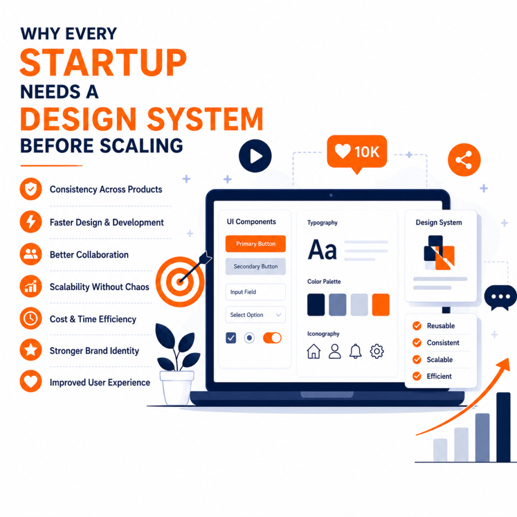
Introduction Every startup begins with a simple goal—build a great product, launch quickly, and acquire customers. During the early stages, speed is everything. Founders focus on validating ideas, developers race to release new features, and designers create screens as quickly as possible. At this stage, very few startups think about building a design system. Initially, this approach works. A small team can manage design decisions informally, and making quick changes is relatively easy. However, as the product grows, the challenges become more apparent. Different designers create different button styles, developers implement components in multiple ways, colors become inconsistent, typography changes across pages, and maintaining the product becomes increasingly difficult. What once felt like rapid progress slowly turns into confusion. This is where a design system becomes one of the smartest investments a startup can make. A design system is not just a collection of UI components or brand colors. It is a structured framework that defines how digital products should look, behave, and evolve. It provides consistency across websites, mobile applications, SaaS platforms, and internal tools while enabling teams to build faster without compromising quality. Companies like Google, Airbnb, Shopify, IBM, Microsoft, Atlassian, and Uber rely heavily on design systems to ensure every product delivers a consistent user experience. While these companies operate on a much larger scale, the same principles are equally valuable for startups. At BlackBuck Design Studios, we’ve worked with businesses at different stages of growth and have seen firsthand how a structured design system helps teams save time, reduce development costs, strengthen brand identity, and create better digital experiences. The earlier a startup adopts a design system, the easier it becomes to scale confidently. What Is a Design System? A design system is a centralized collection of reusable components, design standards, interaction patterns, and documentation that guides how digital products are designed and developed. Think of it as a single source of truth for your product. Instead of every designer creating new buttons or every developer writing different code for similar components, the team uses standardized building blocks that have already been tested and approved. A typical design system includes: These components are reused throughout the product, ensuring that every screen feels familiar to users. Imagine building a house. Without a blueprint, every room might have a different style, different measurements, and different materials. The house would still stand, but it would feel inconsistent and unorganized. A design system acts as that blueprint for digital products. Why Most Startups Ignore Design Systems Many founders believe design systems are only necessary for large organizations. This misconception often leads to problems later. Some common assumptions include: These assumptions are understandable but can become expensive. Every time a new screen is designed differently, every time a developer creates another version of the same button, or every time a new feature introduces inconsistent interactions, the product accumulates design debt. Just like technical debt, design debt grows over time. Eventually, instead of building new features, teams spend valuable time fixing inconsistencies that could have been prevented with a simple design system. What Happens Without a Design System? Many startups don’t realize they have a design problem until their product becomes difficult to manage. Here are some of the most common issues. 1. Inconsistent User Experience Imagine visiting an e-commerce website where every page uses different button colors. Some pages have rounded buttons. Others have square buttons. Some forms require three fields. Others require eight. The navigation changes from one section to another. Users immediately notice these inconsistencies, even if they cannot explain why something feels “off.” Consistency creates confidence. Inconsistency creates uncertainty. Research by the Nielsen Norman Group has consistently shown that users prefer interfaces that follow familiar and predictable patterns because they reduce cognitive effort and improve usability. 2. Slower Product Development Without reusable components, every new feature starts from scratch. Designers repeatedly create similar layouts. Developers repeatedly build similar UI elements. QA teams repeatedly test similar functionality. Instead of focusing on innovation, teams waste time recreating work that already exists. A design system eliminates this duplication. Reusable components allow both designers and developers to build significantly faster while maintaining consistency across the product. 3. Higher Development Costs Many startup founders assume creating a design system is expensive. The opposite is usually true. Without one, businesses spend money fixing inconsistencies, redesigning interfaces, rewriting code, and retraining new team members. These hidden costs often exceed the investment required to build a design system in the first place. According to industry studies on software development, identifying and solving design issues early in the product lifecycle is significantly more cost-effective than fixing them after a product has scaled. 4. Weak Brand Identity Your digital product is often the first interaction customers have with your business. If your website looks professional but your mobile application feels inconsistent, users begin questioning your credibility. Strong brands create memorable experiences through consistency. Every screen should reinforce your brand’s personality. Whether users interact with your website, SaaS platform, mobile application, dashboard, or customer portal, they should immediately recognize your brand. Companies like Apple and Airbnb achieve this exceptionally well because every interaction follows the same visual language. Consistency builds familiarity. Familiarity builds trust. 5. Difficult Team Collaboration As startups grow, more designers, developers, marketers, and product managers join the team. Without clear design standards, everyone begins making independent decisions. One designer may choose one font. Another may choose something different. Developers implement components differently. Eventually, collaboration becomes inefficient because everyone is speaking a different design language. A design system gives the entire organization a common vocabulary. Instead of debating how a button should look, teams simply refer to the existing component library. This improves communication and speeds up decision-making. The Business Benefits of a Design System A well-designed system is far more than a design asset—it is a strategic business tool. It enables startups to: For startups aiming to scale, these benefits create a strong competitive advantage.
How Great Design Reduces User Friction in Digital Products
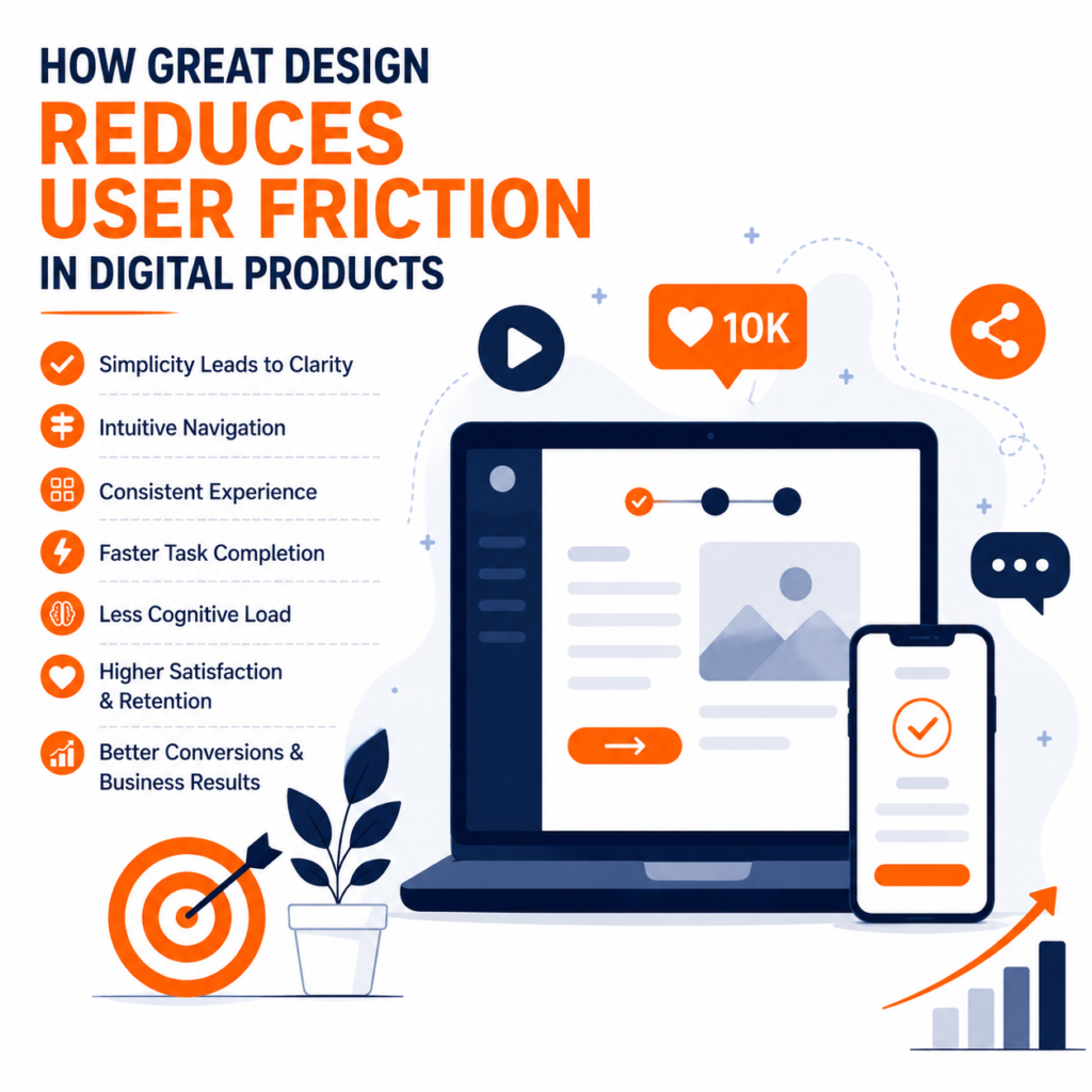
Introduction In today’s digital world, users expect websites, mobile apps, and software products to be fast, intuitive, and effortless to use. They no longer compare your product only with your competitors—they compare it with the seamless experiences offered by companies like Google, Amazon, Apple, Netflix, and Airbnb. If your product feels confusing or difficult, users simply leave. This is where user friction becomes one of the most important factors in digital product success. User friction is any obstacle that prevents users from completing a task quickly and confidently. It may be a slow-loading page, confusing navigation, an unnecessarily long form, unclear buttons, inconsistent layouts, or a complicated checkout process. While each issue may seem small on its own, together they create frustration that affects customer satisfaction, conversion rates, and brand perception. Great design is not about making products look attractive. It is about removing obstacles, simplifying interactions, and helping users achieve their goals with the least possible effort. What Is User Friction? User friction refers to every point in a digital experience where users hesitate, become confused, or need to think harder than necessary. Good UX reduces cognitive load by making interfaces predictable and intuitive. Examples include:• Complicated navigation• Too many form fields• Slow page speed• Poor mobile responsiveness• Weak visual hierarchy• Unclear calls-to-action• Confusing error messages Why It Matters for Businesses A friction-free experience directly impacts business results. Users who enjoy using a product are more likely to complete purchases, recommend the brand, and return. Research from Forrester has frequently highlighted the strong business ROI of investing in user experience, while studies from Baymard Institute consistently show that unnecessary checkout friction contributes to cart abandonment. Reducing friction can improve conversion rates, customer retention, brand trust, and support efficiency. Common Causes of User Friction Navigation that is difficult to understand forces visitors to search for information instead of finding it naturally. Long forms increase abandonment because users feel the effort outweighs the value. Poor mobile optimization creates frustration on smaller screens. Inconsistent buttons and layouts make users relearn the interface on every page. Slow loading times reduce patience and trust. Principles of Great DesignSimplicity keeps interfaces focused on the user’s primary task. Consistency ensures components behave the same throughout the product. Clear visual hierarchy guides attention through typography, spacing, color, and contrast. Immediate feedback through loading indicators and success messages reassures users that the system is working. Accessibility makes products usable for people with different abilities while improving usability for everyone. Real-World ExamplesGoogle’s homepage demonstrates simplicity by presenting one primary action: search. Amazon reduces checkout friction through saved addresses, payment methods, and streamlined purchasing. Airbnb helps users make confident decisions with intuitive filters, transparent pricing, and a guided booking flow. These companies continually test and refine their experiences to eliminate unnecessary friction. How to Reduce User Friction Start by mapping the complete user journey. Observe real users instead of relying on assumptions. Remove unnecessary steps from forms and checkout flows. Improve page speed by optimizing images and code. Design mobile-first experiences. Build reusable UI components using a design system. Continuously measure user behavior through analytics, heatmaps, and usability testing. Why Design Systems HelpAs products grow, consistency becomes harder to maintain. A design system standardizes components, colors, typography, spacing, and interaction patterns so designers and developers can build faster while delivering a consistent experience. This reduces design debt and improves scalability. The Business Value of UXGreat UX is an investment, not a cost. Better usability increases conversions, lowers support costs, strengthens brand credibility, and encourages long-term customer loyalty. In competitive markets, user experience often becomes the deciding factor between similar products. BlackBuck Design Studios Perspective At BlackBuck Design Studios, we believe every design decision should solve a business problem while making life easier for users. Our approach combines user research, UI/UX strategy, branding, and usability testing to create digital products that are visually engaging, intuitive, and conversion-focused. Whether designing websites, SaaS platforms, mobile applications, or e-commerce stores, we focus on reducing friction at every stage of the customer journey. Conclusion The success of a digital product depends on how easily users can accomplish their goals. Every unnecessary click, confusing screen, or slow interaction reduces trust and increases the chance that users will leave. Great design removes these barriers through simplicity, consistency, accessibility, and continuous improvement. Businesses that invest in reducing user friction create experiences that customers enjoy using, recommend to others, and return to repeatedly. In a world where user expectations continue to rise, designing for ease is no longer optional—it is a competitive advantage.
Why Every Modern Brand Needs a Community, Not Just Customers
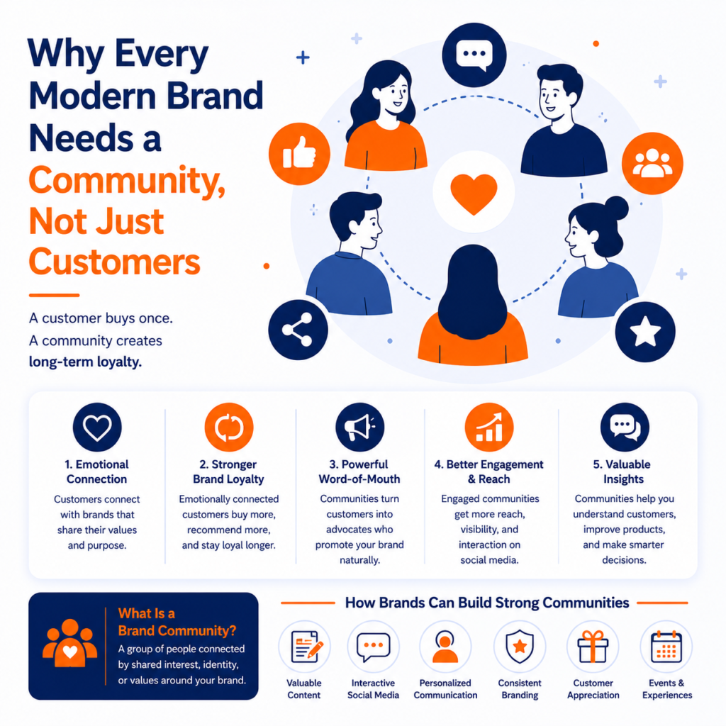
The future of branding is changing rapidly. Businesses can no longer rely only on products and advertising to grow. In 2026, successful brands are focused on building communities instead of simply gaining customers. A customer buys once. A community creates long-term loyalty. Modern consumers want connection, interaction, shared values, and meaningful experiences. Brands that create communities build stronger engagement and sustainable growth. What Is a Brand Community? A brand community is a group of people connected by shared interest, identity, or values around a business. Communities can exist through: Strong communities turn customers into loyal brand advocates. Why Community Matters in 2026 1. Customers Want Emotional Connection Consumers prefer brands that feel authentic and relatable. Businesses that communicate values and purpose create deeper customer relationships. 2. Communities Increase Brand Loyalty Customers connected emotionally to a brand are more likely to: Loyal communities create long-term business growth. 3. Word-of-Mouth Marketing Is Powerful Communities naturally generate conversations. Satisfied customers often become brand promoters through: This creates organic marketing and stronger trust. 4. Social Media Rewards Engagement Modern algorithms prioritize engagement and interaction. Brands that encourage conversations and community participation achieve: Community-driven brands perform better on digital platforms. 5. Communities Improve Customer Understanding Businesses with active communities receive valuable customer feedback. This helps brands: Community insights improve business decisions. How Brands Can Build Strong Communities Businesses can strengthen community building through: Authenticity remains the most important factor. Conclusion In 2026, businesses that focus only on sales will struggle to build long-term loyalty. Modern branding is about creating meaningful relationships. Brands with strong communities generate better engagement, stronger trust, and sustainable growth. The future belongs to businesses that make customers feel connected, valued, and involved.
The Rise of AI-Generated Content: What Brands Should Never Automate
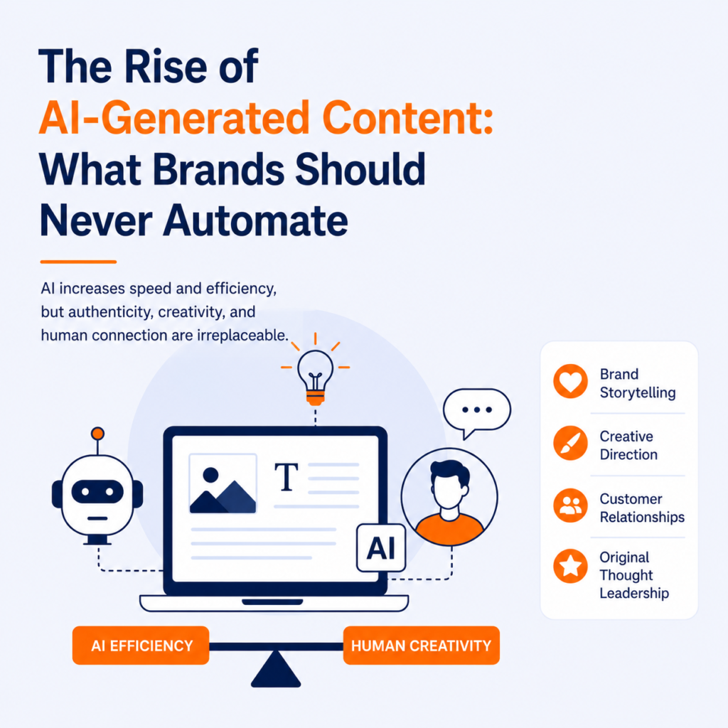
Artificial Intelligence has completely transformed digital marketing and content creation. Businesses now use AI tools for blog writing, social media captions, email campaigns, video scripts, and customer support. While AI-generated content increases speed and efficiency, brands must understand that automation cannot replace authentic human creativity. In 2026, successful businesses are not replacing humans with AI. Instead, they are combining AI efficiency with human storytelling and strategy. The Growth of AI in Marketing AI-powered tools help businesses: This technology allows businesses to scale content production more efficiently than ever before. What Brands Should Never Automate 1. Brand Storytelling A brand story requires emotion, vision, and authenticity. AI can generate text, but it cannot fully capture human experiences. Customers connect with: Businesses that rely only on automated storytelling often sound generic and disconnected. 2. Creative Direction AI tools can assist with design and ideas, but strategic creativity still requires human thinking. Creative direction includes: Human creativity remains essential for unique branding. 3. Customer Relationships AI chatbots can improve customer service, but genuine human interaction builds loyalty. Customers still value: Brands that balance automation with human interaction create stronger customer trust. 4. Original Thought Leadership Businesses using AI-generated content without expertise often publish repetitive and low-value information. Thought leadership requires: AI can assist content creation, but expertise must come from humans. The Future of AI Content in 2026 The future of content marketing is collaboration between AI and human creativity. Businesses that use AI strategically can: However, authenticity will remain one of the most valuable assets in digital marketing. Conclusion AI-generated content is transforming marketing, but businesses should never automate emotional connection, storytelling, and strategic creativity. The brands that succeed in 2026 will use AI as a tool — not a replacement for human identity. Combining technology with authentic communication will create stronger branding and customer loyalty.
Why Most Startups Fail at Branding Before They Even Launch
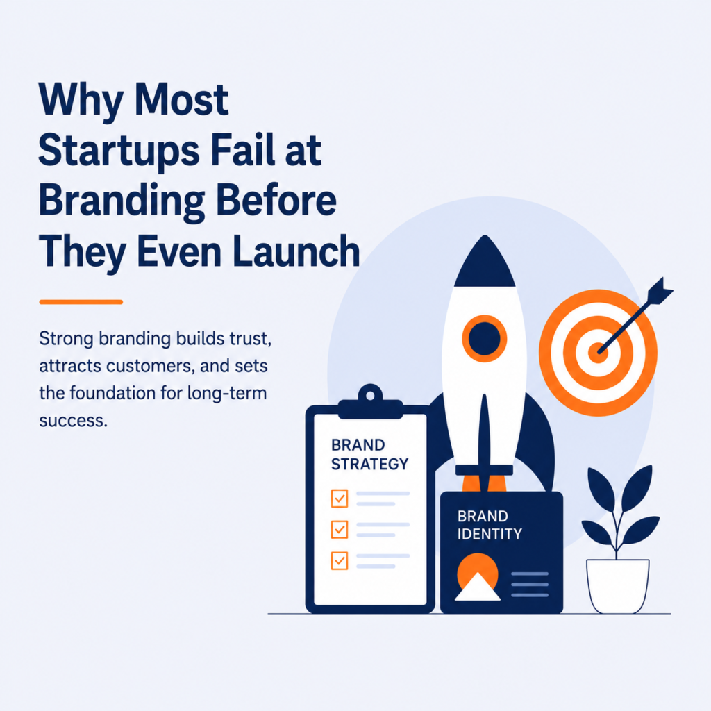
Launching a startup in 2026 is easier than ever, but building a recognizable brand is still one of the biggest challenges for new businesses. Many startups focus heavily on products, services, funding, and operations while ignoring branding. As a result, they struggle to attract customers, build trust, and stand out in a crowded market. Branding is not just a logo or color palette. It is the complete identity of a business. From messaging and design to customer experience and social presence, branding shapes how customers perceive a company. In this blog, we explore why startups fail at branding before launch and how businesses can create a strong foundation for long-term success. 1. Lack of Clear Brand Identity One of the biggest branding mistakes startups make is launching without a clear identity. Businesses often try to appeal to everyone instead of defining a specific audience. A strong brand identity includes: Without clarity, customers struggle to understand what the business stands for. 2. Inconsistent Branding Across Platforms Many startups use different styles, messaging, and visuals across websites, social media, and marketing campaigns. This inconsistency weakens brand recognition. Consistent branding helps businesses: Customers are more likely to trust brands that look organized and visually consistent. 3. Ignoring Brand Storytelling Modern consumers connect emotionally with brands. Businesses that fail to communicate their story often appear generic. A compelling brand story explains: Storytelling helps brands build emotional connections and customer loyalty. 4. Weak Online Presence In the digital era, customers judge businesses within seconds. Poor website design, outdated visuals, or low-quality social media content can damage credibility. Startups need: Digital branding directly impacts customer trust and conversions. 5. Following Trends Without Strategy Many startups copy popular design trends without understanding their audience. While trends can attract attention temporarily, branding should focus on long-term identity. Businesses that prioritize authenticity over trends build stronger customer relationships. Conclusion Startups that invest in branding early create stronger market positioning and long-term growth opportunities. In 2026, branding is no longer optional — it is essential for survival. Businesses with clear identity, strategic design, consistent communication, and authentic storytelling are more likely to succeed in competitive markets. Strong branding does not require a massive budget. It requires clarity, consistency, and customer understanding.
