

Introduction
Take a moment to think about how often you use your smartphone in a day. Whether it’s searching for a restaurant, shopping online, checking emails, booking appointments, reading the news, or browsing social media, most digital interactions now happen on mobile devices. For millions of people, the smartphone is no longer a secondary device—it is their primary gateway to the internet.
This shift has fundamentally changed how businesses should approach digital design. A decade ago, websites were designed for desktop screens and later adapted for mobile devices. Today, that approach no longer meets user expectations. Modern businesses must start with the smallest screen first and build experiences that work seamlessly across every device.
This philosophy is known as mobile-first design.
Although mobile-first design has been discussed for years, many business owners still believe it is simply about making a website responsive. In reality, it is much more than that. It is a strategic design approach that prioritizes user needs, simplifies content, improves performance, and creates better digital experiences from the very beginning.
As we move through 2026, mobile-first design remains one of the most important principles in UI/UX and website development. User expectations continue to rise, search engines prioritize mobile experiences, and businesses that fail to optimize for mobile risk losing both traffic and customers.
At BlackBuck Design Studios, we believe that great digital experiences begin with understanding how people actually use technology. Since mobile devices have become the primary touchpoint for most users, designing for mobile first is no longer a trend—it is a business necessity.
What Is Mobile-First Design?
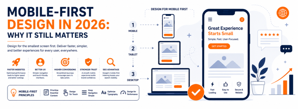
Mobile-first design is a design and development strategy where the product is created for mobile devices before expanding to tablets, laptops, and desktops.
Instead of starting with a large desktop layout and removing elements to fit smaller screens, designers begin with the essentials.
This forces teams to focus on:
- The most important content.
- Clear navigation.
- Fast performance.
- Simple interactions.
- Easy-to-read typography.
- Touch-friendly interfaces.
Once the mobile experience is optimized, additional features and layouts can be progressively enhanced for larger screens.
This approach creates cleaner, more focused digital products that work well across all devices.
Why Mobile-First Still Matters in 2026
Some businesses assume that because responsive design has become common, mobile-first design is no longer important.
The opposite is true.
User behavior continues to evolve, and mobile usage remains dominant across many industries.
Whether customers are searching for products, comparing services, reading reviews, or making purchases, they increasingly expect seamless mobile experiences.
Businesses that ignore mobile-first principles often experience:
- Higher bounce rates.
- Lower engagement.
- Reduced conversion rates.
- Poor search engine visibility.
- Increased customer frustration.
Meanwhile, businesses that prioritize mobile usability create experiences that are faster, simpler, and more enjoyable.
Mobile Is Often the First Brand Experience
For many companies, the first interaction a customer has with the brand happens on a smartphone.
Imagine someone discovers your business through a Google search, Instagram advertisement, or LinkedIn post.
They tap the link expecting a smooth experience.
Instead, they find:
- Tiny text.
- Buttons that are difficult to tap.
- Images that load slowly.
- Menus that don’t work properly.
- Forms that are difficult to complete.
Most users will leave immediately.
They won’t contact your business.
They won’t complete the purchase.
They may never return.
First impressions are increasingly formed on mobile devices.
That makes mobile-first design essential for building trust.
Google’s Mobile-First Indexing
Google has fundamentally changed how it evaluates websites.
Instead of primarily analyzing desktop versions, Google now focuses on the mobile version of a website when determining rankings.
This means your mobile experience directly influences your search engine visibility.
If your mobile website loads slowly, contains poor navigation, or provides a frustrating user experience, it can negatively impact your SEO performance.
Businesses investing in content marketing, paid advertising, and search engine optimization should understand that driving traffic is only part of the equation.
If visitors have a poor mobile experience, much of that investment is wasted.
Benefits of Mobile-First Design
1. Faster Websites
Performance is one of the biggest advantages of mobile-first design.
Since designers prioritize essential content and lightweight layouts, mobile-first websites generally load faster.
Fast-loading websites improve:
- User satisfaction.
- Search engine rankings.
- Conversion rates.
- Customer retention.
Speed is no longer just a technical requirement—it is part of the user experience.
2. Better User Experience
Small screens force designers to simplify interfaces.
This often leads to cleaner layouts, better navigation, and more focused user journeys.
When users don’t have to search for important information, they complete tasks more efficiently.
Good mobile experiences reduce friction and increase confidence.
3. Improved Conversion Rates
Whether users are booking appointments, purchasing products, downloading resources, or submitting enquiry forms, every unnecessary step reduces conversions.
Mobile-first design simplifies these interactions.
Shorter forms, larger buttons, simplified navigation, and clearer calls-to-action encourage users to complete their goals.
Businesses frequently see improved conversion rates after optimizing mobile usability.
4. Stronger Brand Perception
Customers associate digital quality with business quality.
A smooth mobile experience communicates professionalism.
A frustrating experience creates doubt.
Modern customers expect businesses to deliver excellent experiences regardless of screen size.
Professional mobile design demonstrates attention to detail and customer care.
Core Principles of Mobile-First Design
Prioritize Essential Content
Small screens leave little room for unnecessary information.
Every section should answer an important user question.
Instead of overwhelming visitors, focus on helping them complete their primary objective.
Design for Touch
Unlike desktop users, mobile users interact using their fingers.
Buttons should be large enough to tap comfortably.
Links should have adequate spacing.
Interactive elements should reduce accidental clicks.
Touch-friendly design improves usability and accessibility.
Keep Navigation Simple
Complicated navigation creates frustration.
Limit menu options to the most important pages.
Organize content logically.
Help users reach their destination with as few taps as possible.
Optimize Typography
Text should remain readable without zooming.
Maintain sufficient spacing between paragraphs.
Use clear heading hierarchies.
Readable typography improves comprehension and reduces user fatigue.
Design for Performance
Performance begins during the design process.
Compress images.
Reduce unnecessary animations.
Minimize large files.
Optimize code.
Every improvement contributes to a smoother user experience.
Real-World Examples
Many of the world’s most successful companies embrace mobile-first thinking.
Instagram was designed primarily for mobile interactions, making it intuitive for users to browse, engage, and create content.
Uber simplifies complex transportation services into a few straightforward steps, allowing users to book rides quickly even in busy environments.
Amazon continuously refines its mobile shopping experience with intuitive search, personalized recommendations, and streamlined checkout processes.
These companies understand that simplicity, speed, and usability directly influence customer satisfaction and business growth.
Common Mistakes Businesses Make
Many organizations believe responsive design alone is enough.
Common mistakes include:
- Designing for desktop first.
- Using tiny buttons.
- Overcrowding mobile screens.
- Displaying lengthy forms.
- Ignoring page speed.
- Hiding important content.
- Using pop-ups that block the screen.
- Poor mobile navigation.
These mistakes increase user frustration and reduce business performance.
