
Introduction
In today’s digital world, users expect websites, mobile apps, and software products to be fast, intuitive, and effortless to use. They no longer compare your product only with your competitors—they compare it with the seamless experiences offered by companies like Google, Amazon, Apple, Netflix, and Airbnb. If your product feels confusing or difficult, users simply leave. This is where user friction becomes one of the most important factors in digital product success.
User friction is any obstacle that prevents users from completing a task quickly and confidently. It may be a slow-loading page, confusing navigation, an unnecessarily long form, unclear buttons, inconsistent layouts, or a complicated checkout process. While each issue may seem small on its own, together they create frustration that affects customer satisfaction, conversion rates, and brand perception.
Great design is not about making products look attractive. It is about removing obstacles, simplifying interactions, and helping users achieve their goals with the least possible effort.
What Is User Friction?
User friction refers to every point in a digital experience where users hesitate, become confused, or need to think harder than necessary. Good UX reduces cognitive load by making interfaces predictable and intuitive.
Examples include:
• Complicated navigation
• Too many form fields
• Slow page speed
• Poor mobile responsiveness
• Weak visual hierarchy
• Unclear calls-to-action
• Confusing error messages
Why It Matters for Businesses
A friction-free experience directly impacts business results. Users who enjoy using a product are more likely to complete purchases, recommend the brand, and return. Research from Forrester has frequently highlighted the strong business ROI of investing in user experience, while studies from Baymard Institute consistently show that unnecessary checkout friction contributes to cart abandonment.
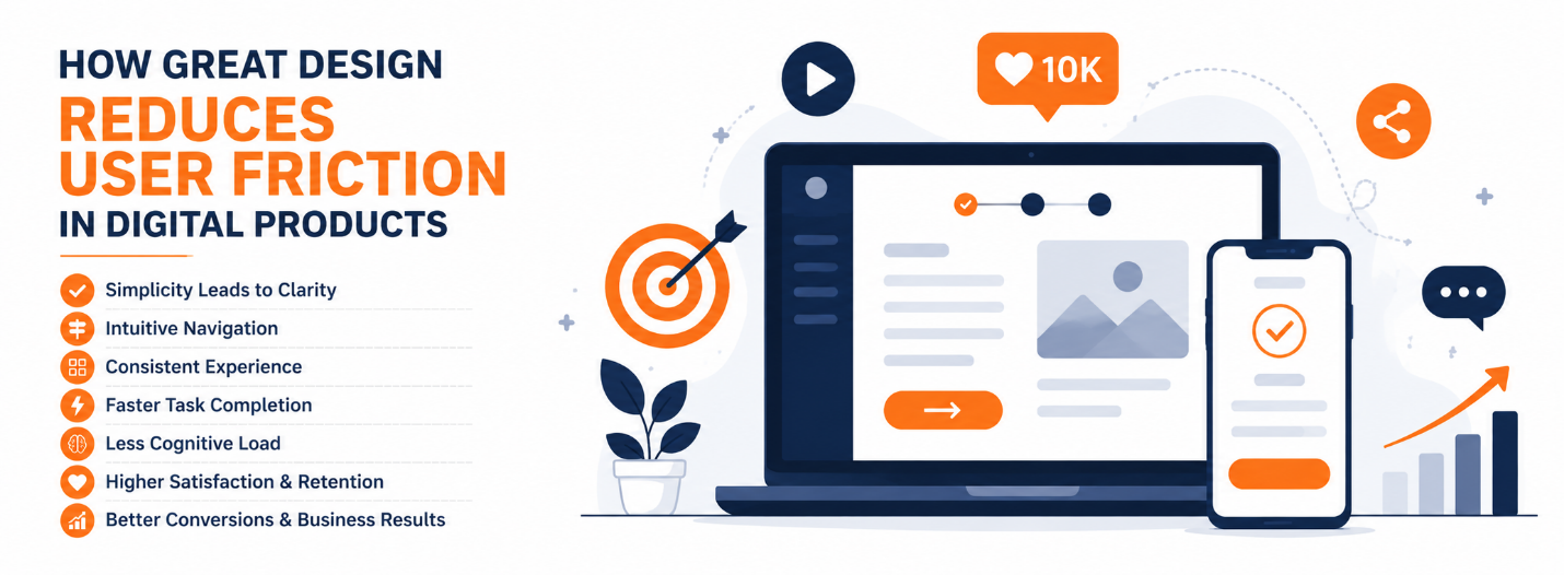
Reducing friction can improve conversion rates, customer retention, brand trust, and support efficiency.
Common Causes of User Friction
Navigation that is difficult to understand forces visitors to search for information instead of finding it naturally. Long forms increase abandonment because users feel the effort outweighs the value. Poor mobile optimization creates frustration on smaller screens. Inconsistent buttons and layouts make users relearn the interface on every page. Slow loading times reduce patience and trust.
Principles of Great Design
Simplicity keeps interfaces focused on the user’s primary task. Consistency ensures components behave the same throughout the product. Clear visual hierarchy guides attention through typography, spacing, color, and contrast. Immediate feedback through loading indicators and success messages reassures users that the system is working. Accessibility makes products usable for people with different abilities while improving usability for everyone.
Real-World Examples
Google’s homepage demonstrates simplicity by presenting one primary action: search. Amazon reduces checkout friction through saved addresses, payment methods, and streamlined purchasing. Airbnb helps users make confident decisions with intuitive filters, transparent pricing, and a guided booking flow. These companies continually test and refine their experiences to eliminate unnecessary friction.
How to Reduce User Friction
Start by mapping the complete user journey. Observe real users instead of relying on assumptions. Remove unnecessary steps from forms and checkout flows. Improve page speed by optimizing images and code. Design mobile-first experiences. Build reusable UI components using a design system. Continuously measure user behavior through analytics, heatmaps, and usability testing.
Why Design Systems Help
As products grow, consistency becomes harder to maintain. A design system standardizes components, colors, typography, spacing, and interaction patterns so designers and developers can build faster while delivering a consistent experience. This reduces design debt and improves scalability.
The Business Value of UX
Great UX is an investment, not a cost. Better usability increases conversions, lowers support costs, strengthens brand credibility, and encourages long-term customer loyalty. In competitive markets, user experience often becomes the deciding factor between similar products.
BlackBuck Design Studios Perspective
At BlackBuck Design Studios, we believe every design decision should solve a business problem while making life easier for users. Our approach combines user research, UI/UX strategy, branding, and usability testing to create digital products that are visually engaging, intuitive, and conversion-focused. Whether designing websites, SaaS platforms, mobile applications, or e-commerce stores, we focus on reducing friction at every stage of the customer journey.
Conclusion
The success of a digital product depends on how easily users can accomplish their goals. Every unnecessary click, confusing screen, or slow interaction reduces trust and increases the chance that users will leave. Great design removes these barriers through simplicity, consistency, accessibility, and continuous improvement.
Businesses that invest in reducing user friction create experiences that customers enjoy using, recommend to others, and return to repeatedly. In a world where user expectations continue to rise, designing for ease is no longer optional—it is a competitive advantage.
